
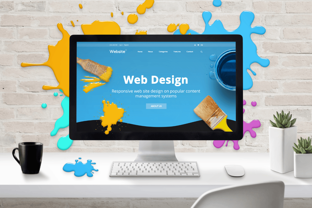
Saviez-vous que 75% de la crédibilité de votre site web est attribuée à son design ? Si votre site présente de nombreuses erreurs de design, vos visiteurs pourraient percevoir votre entreprise comme moins fiable. Que vous construisiez un site de zéro ou que vous modernisiez l’existant, éviter ces erreurs vous permettra de faire ressortir votre entreprise en ligne pour les bonnes raisons.
Dans cet article, nous explorerons les erreurs courantes en design web et vous montrerons comment les éviter, en mettant en avant comment mon expertise en conception de site web peut vous aider à éviter ces pièges et avoir un site web moderne et professionnel.
Sommaire
ToggleNe pas prioriser l’accessibilité
L’accessibilité est souvent négligée, mais elle est cruciale. En ne tenant pas compte des besoins des personnes en situation de handicap, vous pourriez exclure une partie importante de votre audience. Les erreurs d’accessibilité courantes incluent un contraste de couleur insuffisant, l'absence de texte alternatif pour les images, des indicateurs de focus visuel manquants, et des étiquettes accessibles négligées. Ces éléments sont essentiels pour permettre à tous les utilisateurs, y compris ceux ayant des limitations visuelles ou auditives, de naviguer efficacement sur votre site.
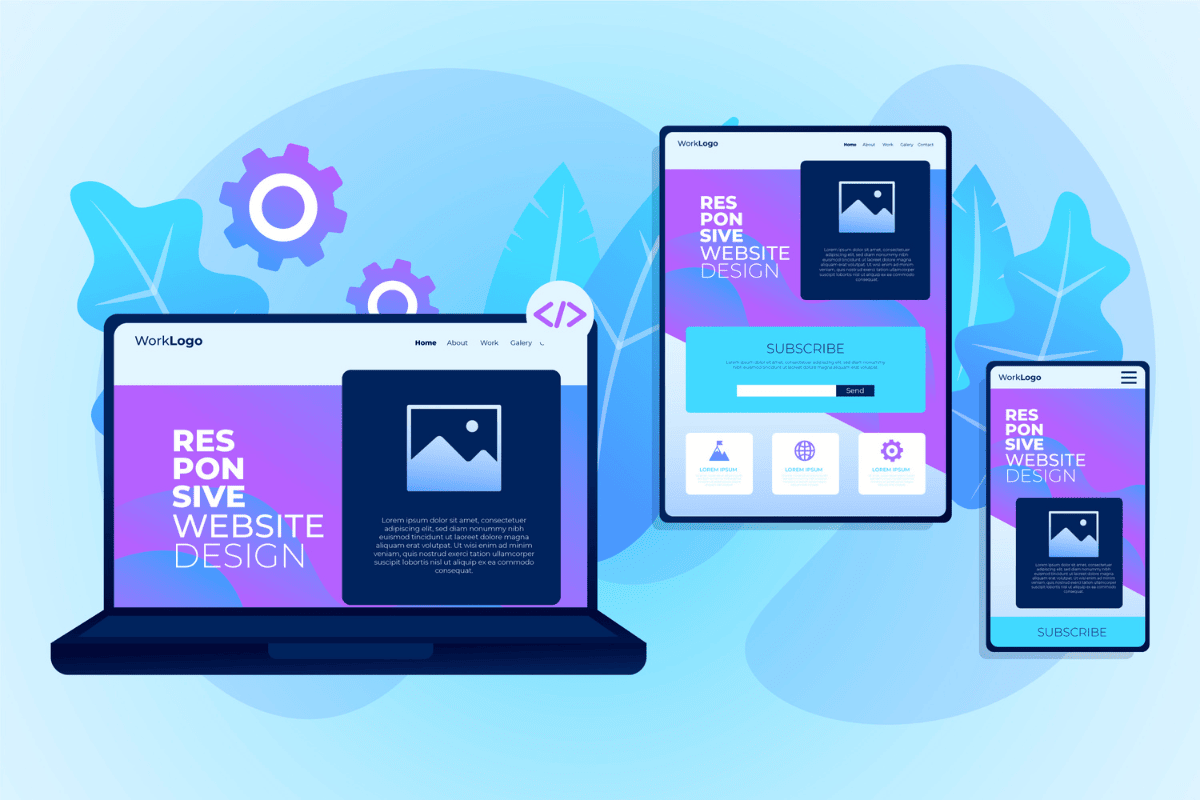
Oublier l’importance du responsive web design
Avec plus de 58% du trafic web mondial provenant des appareils mobiles, il est crucial que votre site soit aussi facile à naviguer sur mobile que sur desktop. Un design responsive assure que votre site est optimisé pour tous les appareils, évitant ainsi de frustrer les visiteurs et d’augmenter le taux de rebond. Cela inclut l'adaptation des images, des textes, et des boutons pour qu'ils soient visibles et utilisables sur des écrans de tailles variées.
Compromettre l’expérience utilisateur pour l’esthétique
Il est tentant de privilégier l’esthétique au détriment de la fonctionnalité, mais cela peut nuire à l’expérience utilisateur. Un design trop chargé peut éclipser l’objectif principal de votre site, rendant la navigation difficile et diminuant la clarté de votre message. L'esthétique doit toujours soutenir la fonctionnalité, en assurant que les utilisateurs trouvent facilement l'information qu'ils recherchent.
Ne pas investir dans la personnalisation
Un site web sans personnalisation peut sembler générique et peu engageant. Utiliser un modèle pré-fait sans personnalisation peut rendre votre site moins distinctif et moins aligné avec votre marque. La personnalisation aide à se démarquer de la concurrence et à créer une connexion plus forte avec vos visiteurs.
Utiliser des fonctionnalités qui ne convertissent pas
Les fonctionnalités inefficaces, comme les carrousels de contenu, peuvent nuire à la performance de votre site. Bien que visuellement attrayantes, ces fonctionnalités peuvent ne pas améliorer les taux de conversion et peuvent rendre votre site plus difficile à naviguer. Il est crucial d'analyser et d'optimiser les fonctionnalités pour qu'elles contribuent véritablement à atteindre vos objectifs commerciaux.
Manque de hiérarchie
Un manque de hiérarchie dans la présentation de l'information peut rendre votre site confus et difficile à utiliser. Une hiérarchie claire guide les visiteurs vers les actions importantes et améliore la lisibilité de votre site. Utilisez des titres, des sous-titres et des mises en forme pour structurer l’information de manière logique et accessible.
Navigation peu claire
Une navigation peu claire peut frustrer les visiteurs et les pousser à quitter votre site. Une structure de navigation intuitive est essentielle pour offrir une bonne expérience utilisateur et faciliter l’accès à l’information. Assurez-vous que les menus sont bien organisés et que chaque section est facilement accessible.
Ne pas communiquer efficacement l’objectif de votre entreprise
Votre site web doit clairement communiquer ce que fait votre entreprise pour éviter que les visiteurs ne se sentent perdus. Un message flou peut entraîner une perte de visiteurs potentiels. Assurez-vous que votre mission et vos services sont présentés de manière claire et convaincante dès la page d'accueil.
En évitant les erreurs courantes en design web telles que négliger l’accessibilité, oublier le design réactif, privilégier l’esthétique au détriment de la fonctionnalité, et ne pas investir dans la personnalisation, vous pouvez améliorer l'expérience utilisateur et la crédibilité de votre site. Pour corriger ces erreurs et optimiser votre site, suivez les conseils de la prochaine section sur comment corriger les erreurs courantes en design web.
Comment corriger les erreurs courantes en design web
Maintenant que vous êtes conscient des erreurs courantes en design web, il est temps de discuter de la manière de les corriger. Ne vous inquiétez pas, prendre conscience de ces erreurs est déjà un grand pas en avant. Voici comment aborder la correction de ces erreurs et améliorer le design de votre site web.
Faites de l’accessibilité une priorité
L’accessibilité est essentielle pour garantir que tous les visiteurs, y compris ceux ayant des handicaps, peuvent utiliser votre site. Créez des personas utilisateurs inclusifs et intégrez les meilleures pratiques d’accessibilité dès les premières étapes du design. Formez-vous aux meilleures pratiques d’accessibilité et utilisez des outils pour tester et améliorer l’accessibilité de votre site.
Assurez-vous que votre site est responsive
Le responsive web design garantit que votre site est bien visible et fonctionnel sur tous les appareils. Testez régulièrement votre site sur différents dispositifs pour détecter les problèmes potentiels et utilisez des modèles optimisés pour les mobiles. Assurez-vous que la version mobile de votre site est aussi complète et fonctionnelle que la version desktop.
Équilibrez esthétique et fonctionnalité
Le design de votre site doit être à la fois attrayant et fonctionnel. Travaillez en étroite collaboration avec votre équipe de design pour équilibrer l’aspect visuel avec les besoins fonctionnels. Assurez-vous que chaque élément de design contribue à l’expérience utilisateur et à la réalisation des objectifs du site.
Investissez dans la personnalisation
La personnalisation rend votre site unique et représentatif de votre marque. Évitez les modèles génériques et créez un design sur mesure qui reflète votre identité. La personnalisation aide à se démarquer de la concurrence et à mieux engager vos visiteurs.
Utilisez des fonctionnalités qui convertissent
Évitez les fonctionnalités inefficaces qui ne contribuent pas à la conversion des visiteurs. Analysez les fonctionnalités que vous utilisez pour vous assurer qu’elles ajoutent de la valeur et améliorez l’efficacité de votre site. Utilisez des données pour optimiser les fonctionnalités et maximiser les conversions.
Créez une hiérarchie claire
Une hiérarchie bien définie facilite la navigation et améliore l’expérience utilisateur. Utilisez des titres, des sous-titres et des mises en forme pour guider les visiteurs et structurer l’information de manière logique. Assurez-vous que chaque élément de votre site est organisé de manière à faciliter la compréhension et l’accès à l’information.
Assurez une navigation intuitive
La navigation de votre site doit être claire et facile à utiliser. Définissez des niveaux de navigation cohérents et testez la structure sur différents appareils pour garantir qu’elle est fonctionnelle. Assurez-vous que chaque élément de navigation est facile à trouver et à utiliser pour vos visiteurs.
Communiquez clairement l’objectif de votre entreprise
Assurez-vous que le message de votre entreprise est clair et visible dès que les visiteurs accèdent à votre site. Utilisez un contenu et un design qui mettent en avant votre mission et vos services de manière efficace. Cela aidera à captiver vos visiteurs et à les guider vers les actions que vous souhaitez qu'ils entreprennent.

Comment mon expertise peut aider
Pour éviter ces erreurs courantes et améliorer la performance de votre site web, j'offre une gamme complète de services adaptés aux besoins spécifiques des PME, des prestataires de services et des établissements éducatifs.
Mon expertise inclue la création de sites web WordPress réactifs, l'optimisation pour l'accessibilité, la personnalisation de designs uniques et l'intégration de fonctionnalités qui maximisent les conversions. J'assure également une hiérarchie claire et une navigation intuitive pour améliorer l'expérience utilisateur et garantir que votre site communique efficacement l'objectif de votre entreprise.
En choisissant mes services, vous bénéficiez d'une expertise qui vous aide à éviter les erreurs courantes en design web et à disposer d'un site d'un site web ultra professionnel.

J'espère que cet article a été utile
Besoin de créer un site web pour votre business ? Contactez-moi pour un devis personnalisé.